A while back I did a post about some fantasy illustrations I was doing and showed the creation process from one of them. I had refrained from posting the other illustrations and giving too much information as to why I was doing them because they were involved in a Christmas surprise. Well Christmas has come and gone so I can reveal to you what it was all about!
My cousin Kelly, who is a very talented writer, decided to collect a bunch of short stories she had written into a nice book and give them away as Christmas gifts to the family. She asked me if I would like to contribute some illustrations to the book and of course I said yes. And The Mists Of Kalador was born...
Below are all the illustrations I did for the book excluding the one that I posted previously, which you can find here: http://jeffmorin.blogspot.com/2010/11/trying-something-different.html
Something I learned in my early days when I illustrated an album cover, was that when something is printed it always comes out darker than it looks on a computer screen. So, with these illustrations I made sure not to make my shadows too dark, knowing that they would be darker when they were printed in the book. Because I kept this in mind they came out just how I imagined in the book.
Wednesday, December 29, 2010
Saturday, December 25, 2010
Saturday, December 18, 2010
Sketch Of The Week: Lady Superhero
This sketch is a bit old but I always liked the way it turned out. Believe it or not I didn't have any reference for this drawing. When I was drawing it I was just doing my best to use what I've learned about anatomy and figure drawing. I love the exaggerations of the form and the way the shapes interact with each other. Now if only I could apply this technique and knowledge to my finished work.
Wednesday, December 15, 2010
Color Planning
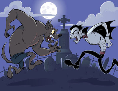
When creating an illustration, I have a bad habit of not planning my colors out in advance. Usually, I won't begin thinking about my color choices until I'm ready to color the image in Adobe Illustrator. This can be a bit of a problem because I wind up spending a lot of time trying to figure out what colors work well together and constantly tweaking them as I go. This is especially time consuming in Illustrator because every block of color or gradient is it's own separate shape with it's own properties. After all this extra work I usually wind up with a color pallet that is a bit different than what I had originally imagined.
So in order to put a stop to this waste of time and remain more accurate to my original visions, I've decided to start using Photoshop to plan out my color pallete. Photoshop makes it really easy to quickly lay down color with the Brush and Fill tools. It also has a lot of Adjustment features making it simple to change hue, saturation, color balance, and many others. Here's how I did it...
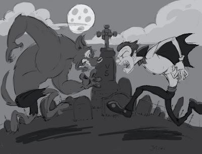
Using my pencils as a guide, I start by blocking in the shades. For an effective composition it's important to keep the shade of each color in mind. Each major shape should be distinguishable against the others. If the image reads clearly in black and white then the composition works.
I knew this illustration was going to be a night scene with some cool colors. Since I had already laid down the shades, this was a simple matter of colorizing the image. I did this by using the Hue/saturation option in the Adjustments menu and checking the colorize box. With the slighty warmer colors on the vampire and wolf, I did the same thing, moving the hue slider around to make the colors a little warmer.
Now, I can just save the image as a JPEG and place it in the illustrator file and use the eyedropper tool to pick my colors.
In the end this method of planning helped speed the process along and made the coloring process much easier.
Sunday, December 12, 2010
Quick Comics: Really Tangled
Why did I, a GROWN MAN, go see Tangled? I don't know. Here's a comic based on that fine film/fairy tale.
Much like the secret comics I drew previously I drew this one really quickly. I'm thinking about doing quick comics like this more often, basing them on movies I've seen. It' s a rather enjoyable experience and it keeps my drawing hand limber. What do you think, would you like that?
Saturday, December 11, 2010
Sketch Of The Week: Guardian Angel
I'm sure a lot of you know some good Christian folks. I'm also sure that a lot of you know some over zealous, overly evangelistic, crazies who like to appoint themselves as your personal guardian angel. You know the type I'm talking about; The type of person that believes that it's their job as a Christian to warn you against the evils of everything you do or enjoy. I'm not talking drugs, sex, or rock an roll either. I'm talking about warnings against seeing Harry Potter or Twilight movies because they have been designed to fool us into thinking that evil things are good. This is the type of person that will very seriously tell you that the devil has had his hands all over your artwork, or that will flat out lie to a young girl, telling her that her favorite musicians practice satanic rituals in the studio to place curses on their listeners. This is the type of person that places a warm penny on a wall covered in latex paint and believes that the penny sticks there because of God's power.
Yes, indeed I'm sure many of you know a person like this. I, of course do not and any resemblance that this angel has to a person living or dead is purely coincidental!
Sunday, December 5, 2010
My Facebook Fan Page
Apparently there's this new fangled thing called Facebook. It's real popular I guess and they made a movie about it and everything. Anyway I started a fan page there for my art. I figured it would be a rather effective way for me to keep people informed on my latest art projects and related news.
I'll be posting links to new releases weather it's on this blog, istockphoto, Inner-Nut.com, or my portfolio site at Jeffmorinart.com. Plus I'll try to keep it up to date with what I'm currently working on and perhaps post some process work too. So if you're interested in my work or would just like to talk about art, head on over and click that little "Like" button on the top of the page. I sure would enjoy hearing from you.
Saturday, December 4, 2010
Sketch Of The Week: Hang In There
I had a dream about a week ago that there was a black cat that crawled up the side of our house somehow. I think it was trying to get into the window or something but It couldn't and it got stuck and died. In the dream I was helping my mom knock the cat off of the wire it was clinging to.
Later when I awoke and was pondering the details of the dream, I realized that the manner in which the cat was holding on to the wire was very similar to the cats in the "Hang In There" motivational posters. Apparently my subconscious is just as pessimistic as the rest of my consciousnesses.
Wednesday, December 1, 2010
Takes The Cake
On occasion, My pal Nick makes custom decorated cakes. I think about a year ago he started doing it with more frequency and he decided that he'd like to make it into a little side business. So, he commissioned me to create this mascot/logo for use on business cards and the like.
Nick wanted a cartoon version of himself in full chef garb running with a cake. This would go along with the name of the business, Takes The Cake. A clever name indeed.
Usually it takes quite a few different sketches before I really nail a design, but in this case I got it with the first one. No matter how hard I tried I couldn't come up with anything I liked better than that. But just to give Nick some options I did one more little sketch. Then I sent the sketches to nick and indicated to him that I liked the top one best, and he agreed. Since the sketch turned out so well I really didn't want to redraw it and risk stiffening up the pose too much. So, I decided to use the thumbnail sketch for the final illustration and make any necessary changes or tweaks in illustrator.
Saturday, November 27, 2010
Sketch Of The Week: Smelloggs Zap-Os
I love a good cereal box design. It seems like they are hard to come by these days.
I haven't done any graphic design projects in a while and I was thinking about beefing up that portion of my portfolio on Jeffmorinart.com. One of the things I wanted to do was to create some cereal box designs based on my own made up cereals. This is one of the ideas I was kicking around.
Saturday, November 20, 2010
Sketch Of The Week: Sloppy John
This guy, whom I've nick named Sloppy John, Comes into the supermarket where I work. He likes to chat it up with the employees. At first I didn't really like him all that much and it wasn't because he resembled a homeless person or smelled of stale beer and sweat, it was because all he ever seemed to talk about was how horrible our county was. He would complain about the people that lived here with such hatred and anger. The reason it made me so angry was because he was the spitting image of the people he was complaining about.
Eventually I grew to hate him less and I learned quite a bit about him during his many beer runs to the store. This man was quite the paradox; His parents immigrated to New York from Germany in the 40's, he spent some time in the military, he's a homosexual, he was a school teacher, and a pig farmer. On top of that he styles his facial hair like some kind motorcycle enthusiast. In the end ol' John turned out to be a pretty interesting guy with an interesting life.
Wednesday, November 17, 2010
Trying Something Different
Recently, I've been working on a personal project of sorts. I don't want to get into too many of the details right now because it's a bit of a surprise for a select few individuals. Basically, for this project I had to do a bunch of fantasy based illustrations. I decided to take the opportunity to experiment a bit with some techniques I've been wanting to try.
Generally, the work I do mostly consists of very cartoony illustrations done digitally. For these Illustrations I wanted to create a marriage of digital and traditional mediums. On top of that I wanted to take the opportunity to practice my inking with a more semi realistic style. I've drawn in this style before but I haven't done it very often using actual brush and ink. (or in this case, an amazing Pentel Brush pen).
My plan was to give the colors a painted quality. I've seen a lot of other artist do this using a flat painted texture and overlaying it on the colors in Photoshop. When done properly, that method can work quite well, but you can still tell that that painted texture was added later. I decided to do something similar but instead create a painted texture exclusively for each illustration.
Oddly enough, I was somewhat inspired by the recent work that KC Green was doing on his webcomic Gun Show. Apparently he used an ink wash to create the gray tones on his comic then inked the line art over that. I thought it gave it a very nice classic illustrated look. I'm not quite as brave as Mr. Green so rather than do it all on one sheet of paper, I traced my line art on to another piece of paper and used a charcoal gray water color to create the gray tones.
Once I had both images scanned in I combined them in photoshop, keeping each one on it's own separate layer. I made sure to set the layer blending options to Multiply that way the white areas would be transparent so my colors would show through. When adding the color I used some of the texture and scattering options on the Photoshop brushes to maintain the painted look. For the most part, the coloring stage was rather quick since most of the work had been done by creating the water color shades before hand.
In the end, I learned some new things about inking, painting, and digital coloring techniques. And I wound up with about 2 or 3 portfolio worthy illustrations.
After the surprise is revealed, I will do another post featuring all 7 Illustrations that I created for this project.
Update 12/29/10: Check out the rest of the illustrations here: http://jeffmorin.blogspot.com/2010/12/fantasy-illustrations.html
Saturday, November 13, 2010
Sketch of the Week: I'm A Creep
There's a lot of little sloppy doodles on this page but for this edition of Sketch Of The Week I'd like to focus on the little lady contained within the dotted line. Whenever I encouter somebody who is both attractive and unique looking I feel the need to draw them. So, I will take a mental picture and save it for later when I have the opportunity to do a sketch. Most of the time the people I feel the need to illustrate are female. And I do realize this probably makes me seem like a weirdo creep.
While my desire to draw these ladies may be influenced by my natural attraction to them it's certainly not my number one motivation. Men are easy to draw because they are hideous angular creatures. But you see, woman are not that easy to draw. There are certain subtleties to the female form. One wrong move and you've drawn a man with breasts. In order to make it easy on themselves a lot of artist, including myself settle on drawing the cliche idea of a beautiful woman (mainstream comic artists especially). This usually consists of a small nose, full pouty lips and of course big ol' boobies. but in life a female could have only some or none of these traits and still be very appealing. So, I feel that it's very important to study what qualities do make them appealing in order to bring them to my future illustrations.
Obviously, this sketch is somewhat sloppy and stylized but it's not meant to be an accurate portrait of this person. That would be difficult anyway since I was just drawing from memory. Instead it's a quick Caricature designed to capture those traits that make her interesting. In this case I found her skinny frame and slumped posture very interesting.
So I'm not sure how many people are even interested in my boring explanations about my sloppy doodles. I would love to hear from you though. Please feel free to leave your comments. Maybe you've got a question, compliment, complaint or you'd just like to tell me how creepy I am.
Saturday, November 6, 2010
Sketch Of The Week: Inhaler Man
I've had asthma all my life. I remember when I was young, for a short time I was a member of some kind of Asthma Club. I guess the point of the club was to make kids not feel so bad for being picked last in gym or something. Anyway, I remember having a magazine or pamphlet that had a cartoon inhaler mascot on it. I can't imagine that the actual mouth piece was on the inhaler man's crotch but it seems like the appropriate place for it to be on an inhaler man. I just can't imagine where else you could put it. Maybe on his butt. Still either way, It's just plain wrong.
Saturday, October 30, 2010
Sketch Of The Week: Psychic
It seems that I've been neglecting my internet presence as of late. Which is no good for a budding illustrator like myself. It's easy to become busy with projects and forget to make time for anything else. So, I've decided that I need to put a stop to that. I'm going to make more of a conscious effort to keep things up to date, starting with this blog.
In addition to creating more general blog posts on a regular basis I'm going to start this weekly feature called Sketch Of The Week. Once a week I will post a sketch and talk about it a bit. It should be fairly simple so I'll be able to keep up with it even if I'm really busy. Now on to this weeks sketch, The Psychic...
I drew this one about a year ago. I was going to turn it into a stock vector illustration for Istockphoto. The sketch sat in a drawer for months until I finally decided to work on it. The only problem was, by that time I wasn't as happy with the drawing as I originally was. There were minor flaws here and there that bugged me. You can see some of the darker lines wear I was trying to fix things in Photoshop. At one point I started to ink it in Adobe Illustrator but I think I just lost interest in it and couldn't bring myself to finish it. I think I would like to do a complete illustration of this but I'm going to start from scratch if I do.
Sunday, August 22, 2010
Desk Doodles
I was cleaning up some of the clutter on and in my desk the other day and I collected a bunch of these scrap papers with doodles on them. I've probably accumulated these over a period of five years. I was going to toss some of them out but it's very difficult for me to throw away any artwork even if it is a sloppy doodle. So I decided to post them here. I know that I like looking at the doodles and sketches of other artists, so maybe there's some folks out there that will enjoy checking out mine. If I find more I'll post them later.
Monday, July 26, 2010
Secret Comics
I posted these comics on my twitter a while back. I was going to do a series of secret twitter comics but I decided my energy was better spent on doing comics for my website. Doing these was actually quite fun. I drew them as quickly as I could and they actually didn't turn out all that bad.
Friday, May 21, 2010
My Lost Prediction Came True
I drew this way back during the second or third season of Lost, I'm not sure which exactly. It was right around the time they revealed that the monster was a mass of floating smoke. It seems that I was able to predict that John Locke and the smoke monster would become one someday. Actually, my idea was a little different than the shows. I think Locke is supposed to be using the smoke like some kind of symbiotic suit. But still it's pretty damned impressive! It's like I have some kind of crazy show predicting powers.
Let's put these powers to the test! Here's my prediction for the Lost finale: Jack goes down into the tunnel of light and emerges as a white smoke monster. Then he fights with the black smoke monster and they get all tangled up together and form a giant Yin Yang. All the cast aways will look up at them and be all, "ooooh. Ones black and the others white. It's like good and evil. I get the metaphor now." The End. We'll see if my prediction will come true on Sunday!
Sunday, May 16, 2010
What I've Been Up To: Sexy Ladies, Farts and More!
I've been busy working on lots of art projects lately and neglecting my presence here in the land of the internet. So I figured I better make an appearance and show all of my millions of fans what I've been up to. Here are some delightful samples:
This freaky looking hottie is the mascot for Frankenstein Studios. I've been working with some friends of mine on a recording project. I'll be doing some illustration and animated stuff for this project as well as vocal recordings. We named our studio Frankenstein Studios because of the trash that was dug up to put it together. Anyway, I came up with the idea of doing a sexy bride of Frankenstein to put on our Youtube page to grab the attention of sex perverts and trick them into watching our videos. Hopefully it works. Check it out. We put some silly videos on there to kick things off, including the Disappointmentville: Work is Hell Audio Comic For the Illiterate.
This month I've been doing shit tons of vector art for my istockphoto portfolio. I'm trying to make a good passive income from this so I can make an easy transition from sad supermarket clerk to slightly less sad freelance cartoonist. So far I've uploaded twelve new vectors to my portfolio. You can check them all out on in my istock portfolio.
These two sexy ladies are part of 1 of 4 promotional comic strips I did for winthetrophy.com.
You can check out all of the strips I illustrated on the Win The Trophy about page.
Anyway, That's what I've been up to latley. Maybe I can try and do even more stuff and then never see the sun or other people again! Yeah!... :(
You can check out all of the strips I illustrated on the Win The Trophy about page.
Anyway, That's what I've been up to latley. Maybe I can try and do even more stuff and then never see the sun or other people again! Yeah!... :(
Tuesday, April 20, 2010
Rudolph Comic Chapter Two
I did it! I'm done! Well, with part two anyway. That's part two of Rudolph The Hideous Abomination, a comic idea that came to me around Christmas time and started out real simple but then turned into a 50 page online graphic novel. The completion of chapter 2 makes it 19 pages so far. You can read it from the begining right here: http://inner-nut.com/comics/rudolph/rudolph_title.htm
Saturday, March 27, 2010
Alternate Disappointmentville
I was looking through some old Disappointmentville comics on my hard drive and I came across this alternate version of "Birthday Surprise".
This was still in the early days of drawing comics on the computer so I was still a bit slow at it. I think I was in a hurry to get it done so I decided that the comic could still be funny if I removed some of the dialog and the last two panels. In retrospect, I like this version much better. I think I'll put this up in the d-ville archive along with the final version. I don't know why I never have before.
Wednesday, February 24, 2010
Face Lift
I gave the front page of my portfolio site a bit of a face lift today. I drew a new characiture of myself that looks way better than the old one. I wonder how many art jobs I lost because of that old one. I did a blog post a little while ago showing off a sketch I did of a prospective new characiture but I wound up drawing this one that looked way better, in my opinion. I also did a new logo which I hate less than the older one. You can see them both at home at jeffmorinart.com.
Sunday, February 21, 2010
Morning Sketch
While I was waiting for my slow computer to finish updating my virus checker I decided to do some sketches. I drew that sloppy looking dude on the right and decided that he looked a little like Harvey Bullock from Batman so I drew Batman as well. I like how they turned out. The lines have a lot of motion and life to them. That's something that I've been trying to improve in my work. I want the characters to seem like they are moving even when they are just standing there. I've found that it's important to move very quickly when drawing. The slower you go the stiffer your lines become. You have to have confidence, which is not an easy thing to have when you are your own worst critic. That's why I like to ink my comics in Photoshop. I can move really quickly and if I mess up I just undo the line until it looks right. I think it helps in maintaining those lively lines from the original pencils.
Saturday, February 20, 2010
Smelly Feet Stock Illustration
This is the latest illustration I did for istockphoto.com. I've been creating stock illustrations for about a year now. I've heard that the illustration world frowns upon doing stock, but I don't care. It's a really good way for a starving artist to make money on the side while also honing your skills. At first I didn't think it was worth it because I wasn't getting very many downloads. Then I started adding more files and the downloads started to come more frequently. And the cash started rollin' in! Actually, I haven't made that much money on it yet but I seem to get a handful of downloads every month. I've only got 24 files uploaded and I've had 54 downloads, but for the first six months or so I only had 3 or 4 files uploaded. So my download success rate doesn't seem too bad.
Once I'm finished with Chapter two of my comic Rudolph the Hideous Abomination I think I'll work on some illustrations before I start Chapter three. Then once I'm done with the comic I think I am going to spend a few months just working on stock illustrations. I want to turn this into a big chunk of my income if I can. It's the only real for sure thing I have going right now.
Wednesday, February 17, 2010
Godzilla's Balls
This is a comic that I drew quite a while ago. At the time I had this idea that I would do a series of comics that I drew in my sketchbook while at work and then I'd post them online calling it Tales From The Milk Box. The problem was that every time I drew a comic at work I'd end up not liking the way it looked so I'd want to redraw it. This was the case with my comic Justice League Fan Fiction . Eventually I just scrapped the whole drawing comics in my sketchbook thing mostly because I never had enough time at work to do it anyway.
I still had a lot of random comic ideas floating around in my head, so I decided to draw them all at home like a normal person. But unfortunately none of this really ever panned out because I was always too busy working on bigger and better things. So, here I was stuck sitting on this great Godzilla comic. At one point I decided I should redraw it because I didn't like the artwork anymore and I drew it when I was still getting used to inking things with pen and paper. The problem is who the heck knows if I will ever get around to doing that. I can't just keep this locked away in the Morin vault any more. So here it is world, a comic about Godzilla's balls!
Monday, February 15, 2010
Family Guy is Afraid of the Retardeds
Last night's family guy saw Chris Griffin dating a girl with Down syndrome. Sound like a recipe for hilarity? Wrong! It seemed as if they were too afraid of offending somebody so the episode was pretty boring over all.
Anyway, this reminded me of a comic I drew documenting a real life interaction I had with a co-worker of mine. This really shouldn't be offensive to anyone after all it really happened to me, only slightly exaggerated for comedic effect.
Sunday, February 14, 2010
First post and doodles
Hello everyone. It's me Jeff Morin, artist extraordinaire! This is my first post on this blog. Mostly I'm going to use this blog to post art and sketches I have done while plugging my webstie.
Anyway, I thought I'd kick this off with a few doodles I did. I decided that I wanted to draw a new cartoon version of me for the front page of jeffmorinart.com I wanted to do something less flat and more cartoony. The hairy guy on the left there is what I came up with. I'm not sure if it's exactly what I'm going for but it will do for now. The rest of the doodles are just me playing around with goofy facial expressions, and there's a dog face for some reason. Enjoy!
Subscribe to:
Posts (Atom)