Wednesday, December 29, 2010

Fantasy Illustrations

A while back I did a post about some fantasy illustrations I was doing and showed the creation process from one of them. I had refrained from posting the other illustrations and giving too much information as to why I was doing them because they were involved in a Christmas surprise. Well Christmas has come and gone so I can reveal to you what it was all about!

My cousin Kelly, who is a very talented writer, decided to collect a bunch of short stories she had written into a nice book and give them away as Christmas gifts to the family. She asked me if I would like to contribute some illustrations to the book and of course I said yes. And The Mists Of Kalador was born...
Below are all the illustrations I did for the book excluding the one that I posted previously, which you can find here: http://jeffmorin.blogspot.com/2010/11/trying-something-different.html


Something I learned in my early days when I illustrated an album cover, was that when something is printed it always comes out darker than it looks on a computer screen. So, with these illustrations I made sure not to make my shadows too dark, knowing that they would be darker when they were printed in the book. Because I kept this in mind they came out just how I imagined in the book.

Saturday, December 18, 2010

Sketch Of The Week: Lady Superhero


This sketch is a bit old but I always liked the way it turned out. Believe it or not I didn't have any reference for this drawing. When I was drawing it I was just doing my best to use what I've learned about anatomy and figure drawing. I love the exaggerations of the form and the way the shapes interact with each other. Now if only I could apply this technique and knowledge to my finished work.

Wednesday, December 15, 2010

Color Planning


When creating an illustration, I have a bad habit of not planning my colors out in advance. Usually, I won't begin thinking about my color choices until I'm ready to color the image in Adobe Illustrator. This can be a bit of a problem because I wind up spending a lot of time trying to figure out what colors work well together and constantly tweaking them as I go. This is especially time consuming in Illustrator because every block of color or gradient is it's own separate shape with it's own properties. After all this extra work I usually wind up with a color pallet that is a bit different than what I had originally imagined.

So in order to put a stop to this waste of time and remain more accurate to my original visions, I've decided to start using Photoshop to plan out my color pallete. Photoshop makes it really easy to quickly lay down color with the Brush and Fill tools. It also has a lot of Adjustment features making it simple to change hue, saturation, color balance, and many others. Here's how I did it...


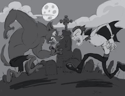
Using my pencils as a guide, I start by blocking in the shades. For an effective composition it's important to keep the shade of each color in mind. Each major shape should be distinguishable against the others. If the image reads clearly in black and white then the composition works.


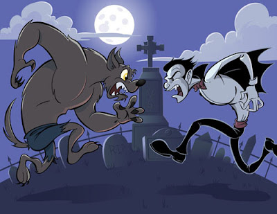
I knew this illustration was going to be a night scene with some cool colors. Since I had already laid down the shades, this was a simple matter of colorizing the image. I did this by using the Hue/saturation option in the Adjustments menu and checking the colorize box. With the slighty warmer colors on the vampire and wolf, I did the same thing, moving the hue slider around to make the colors a little warmer.

Now, I can just save the image as a JPEG and place it in the illustrator file and use the eyedropper tool to pick my colors.

In the end this method of planning helped speed the process along and made the coloring process much easier.

Sunday, December 12, 2010

Quick Comics: Really Tangled

Why did I, a GROWN MAN, go see Tangled? I don't know. Here's a comic based on that fine film/fairy tale.

Much like the secret comics I drew previously I drew this one really quickly. I'm thinking about doing quick comics like this more often, basing them on movies I've seen. It' s a rather enjoyable experience and it keeps my drawing hand limber. What do you think, would you like that?

Saturday, December 11, 2010

Sketch Of The Week: Guardian Angel

Yes, I know Guardian is spelled wrong. My sketch book doesn't have spell check.

I'm sure a lot of you know some good Christian folks. I'm also sure that a lot of you know some over zealous, overly evangelistic, crazies who like to appoint themselves as your personal guardian angel. You know the type I'm talking about; The type of person that believes that it's their job as a Christian to warn you against the evils of everything you do or enjoy. I'm not talking drugs, sex, or rock an roll either. I'm talking about warnings against seeing Harry Potter or Twilight movies because they have been designed to fool us into thinking that evil things are good. This is the type of person that will very seriously tell you that the devil has had his hands all over your artwork, or that will flat out lie to a young girl, telling her that her favorite musicians practice satanic rituals in the studio to place curses on their listeners. This is the type of person that places a warm penny on a wall covered in latex paint and believes that the penny sticks there because of God's power.

Yes, indeed I'm sure many of you know a person like this. I, of course do not and any resemblance that this angel has to a person living or dead is purely coincidental!

Sunday, December 5, 2010

My Facebook Fan Page

Apparently there's this new fangled thing called Facebook. It's real popular I guess and they made a movie about it and everything. Anyway I started a fan page there for my art. I figured it would be a rather effective way for me to keep people informed on my latest art projects and related news.

I'll be posting links to new releases weather it's on this blog, istockphoto, Inner-Nut.com, or my portfolio site at Jeffmorinart.com. Plus I'll try to keep it up to date with what I'm currently working on and perhaps post some process work too. So if you're interested in my work or would just like to talk about art, head on over and click that little "Like" button on the top of the page. I sure would enjoy hearing from you.

Saturday, December 4, 2010

Sketch Of The Week: Hang In There


What do you think, Should I make this into a demotivational poster?


I had a dream about a week ago that there was a black cat that crawled up the side of our house somehow. I think it was trying to get into the window or something but It couldn't and it got stuck and died. In the dream I was helping my mom knock the cat off of the wire it was clinging to.

Later when I awoke and was pondering the details of the dream, I realized that the manner in which the cat was holding on to the wire was very similar to the cats in the "Hang In There" motivational posters. Apparently my subconscious is just as pessimistic as the rest of my consciousnesses.

This is one of the many Hang In There kitties.

Somewhat ironically, as I sit here writing this, there is a group of crows out on my street feasting on the dead carcass of a black cat. Is this some kind of message from beyond? Is God trying to tell me something? If so, it seems pretty bleak.

Wednesday, December 1, 2010

Takes The Cake


On occasion, My pal Nick makes custom decorated cakes. I think about a year ago he started doing it with more frequency and he decided that he'd like to make it into a little side business. So, he commissioned me to create this mascot/logo for use on business cards and the like.

Nick wanted a cartoon version of himself in full chef garb running with a cake. This would go along with the name of the business, Takes The Cake. A clever name indeed.

Usually it takes quite a few different sketches before I really nail a design, but in this case I got it with the first one. No matter how hard I tried I couldn't come up with anything I liked better than that. But just to give Nick some options I did one more little sketch. Then I sent the sketches to nick and indicated to him that I liked the top one best, and he agreed. Since the sketch turned out so well I really didn't want to redraw it and risk stiffening up the pose too much. So, I decided to use the thumbnail sketch for the final illustration and make any necessary changes or tweaks in illustrator.